Summary Dashboard
Introduction/Purpose
The Trade Dashboard serves as the central command center for your white product (oil) trading operations. It provides a comprehensive, at-a-glance summary of your business's performance, highlighting key financial and operational metrics, emerging trends, and critical issues that require immediate attention.
This powerful visual tool is designed for managers and executives to quickly assess the health of the business and make data-driven decisions.
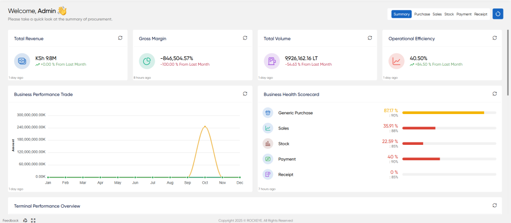
Total Revenue
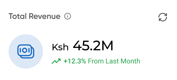
Total Revenue: Shows the total income generated from the sale of products within the current period. The percentage figure indicates the growth or decline compared to the previous month.
Gross Margin
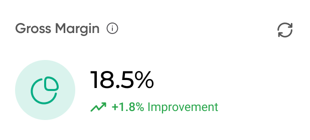
Gross Margin: Represents the profitability of your core business operations. It is calculated as (Revenue - Cost of Goods Sold) / Revenue. The percentage shows the improvement or decline in profitability.
Total Volume
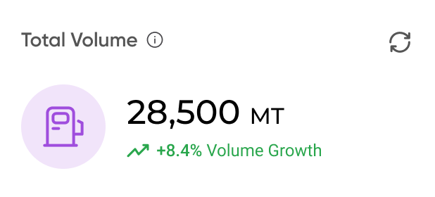
Total Volume: Displays the total quantity of product sold, measured in Metric Tons (MT). The percentage indicates the growth in sales volume.
Operation Efficiency
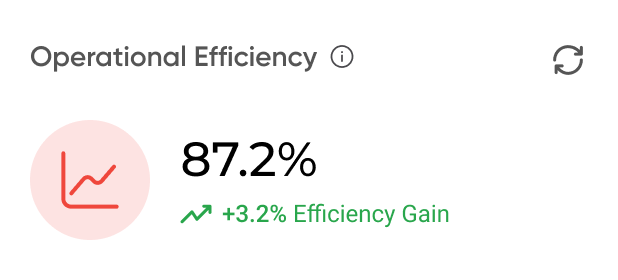
Operational Efficiency: A composite score that measures how effectively your company is using its resources to process transactions from procurement to delivery. A higher percentage signifies smoother, more cost-effective operations.
Business Performance Trends
This line graph visualizes key business metrics over a period of time (e.g., the last six months). It helps you identify patterns, seasonal trends, and the overall trajectory of your business. Each line typically represents a different metric
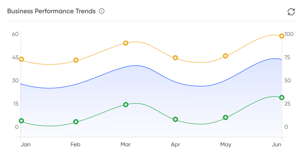
- Yellow Line: Gross Revenue
- Blue Area/Line: Net Profit or Sales Volume
- Green Line: Costs or Margin
Business Health Scorecard
This widget provides a quick assessment of performance across different functional areas of your trade cycle. It compares the actual performance percentage against pre-defined targets.
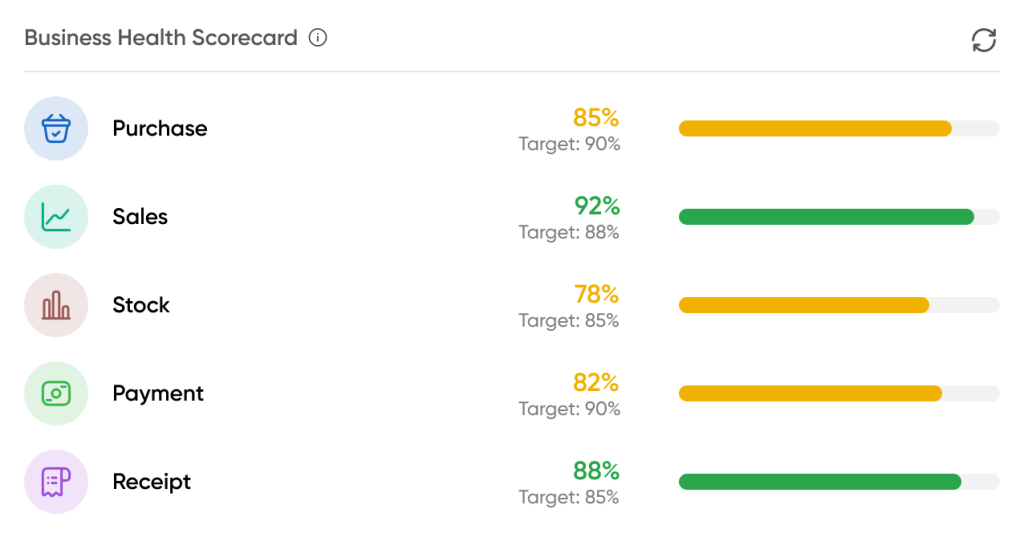
- Purchase: Efficiency of the procurement process.
- Sales: Performance of the sales cycle, from quotation to order fulfillment.
- Stock: Effectiveness of inventory management and control.
- Payment: Timeliness of outgoing payments to vendors.
- Receipt: Efficiency of collecting payments from customers.
The progress bars are color-coded for easy interpretation (e.g., green for meeting or exceeding targets, yellow for being below target).
Terminal Performance Overview
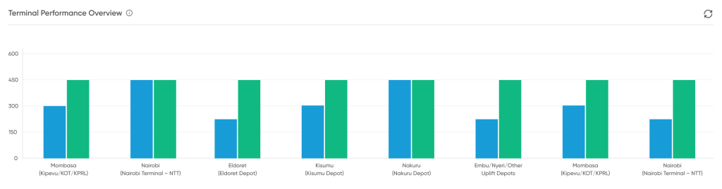
This bar chart provides a comparative view of performance across different physical locations (terminals or depots). It is essential for understanding which terminals are the most active or efficient. The Y-axis typically represents a key metric like product throughput (volume in/out) or turnover.
Critical Issues Requiring Attention
This is an actionable alert system that flags the most urgent issues that could impact your business. Each alert includes:
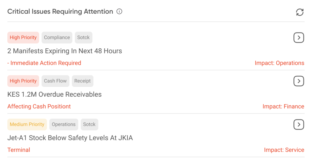
- Priority Level: (e.g., High, Medium) to indicate urgency.
- Description: A summary of the issue (e.g., expiring manifests, overdue receivables, low stock levels).
- Tags: Categories to quickly identify the affected area (e.g., Compliance, Cash Flow, Operations).
- Impact: The potential consequence if the issue is not addressed (e.g., Impact: Operations, Impact: Finance).
Platts Monthly Rate Trend Analysis
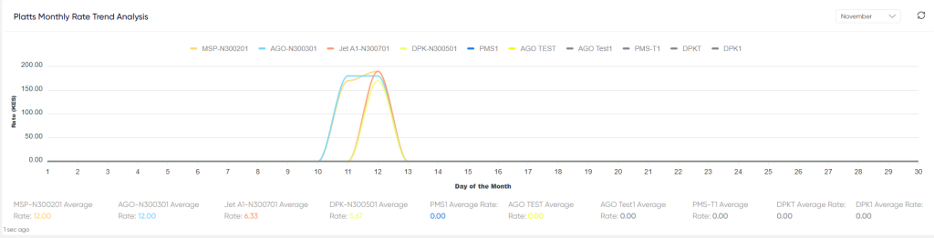
- The Platts Monthly Rate Trend Analysis chart is a financial tool used to visualize how the market price for various petroleum products changes daily over the course of a month.
- It functions as monthly-period graph where the horizontal axis tracks the Day of the Month and the vertical axis tracks the Rate in Kenya Shillings (KES).
- Each colored line represents a different product, such as Diesel (AGO), Gasoline (MSP), or Kerosene, allowing users to compare their pricing movements instantly.
- The primary purpose is to help finance and procurement teams monitor price volatility—identifying periods when prices peak or drop steeply—to make informed decisions about inventory valuation and when to purchase commodities.

